New and improved! Don't tell anyone.
Tide's brand awareness sits somewhere around 100%. There is no American shopper who needs to be told what it is. What they needed — and what the brand had quietly developed — was a formula built for how people actually dress and live today. More fragrance, stronger cleaning performance, optimized for the fabrics that define modern wardrobes. But after decades of loyalty, the work wasn't awareness. It was trust — and how you honor it while still moving forward.
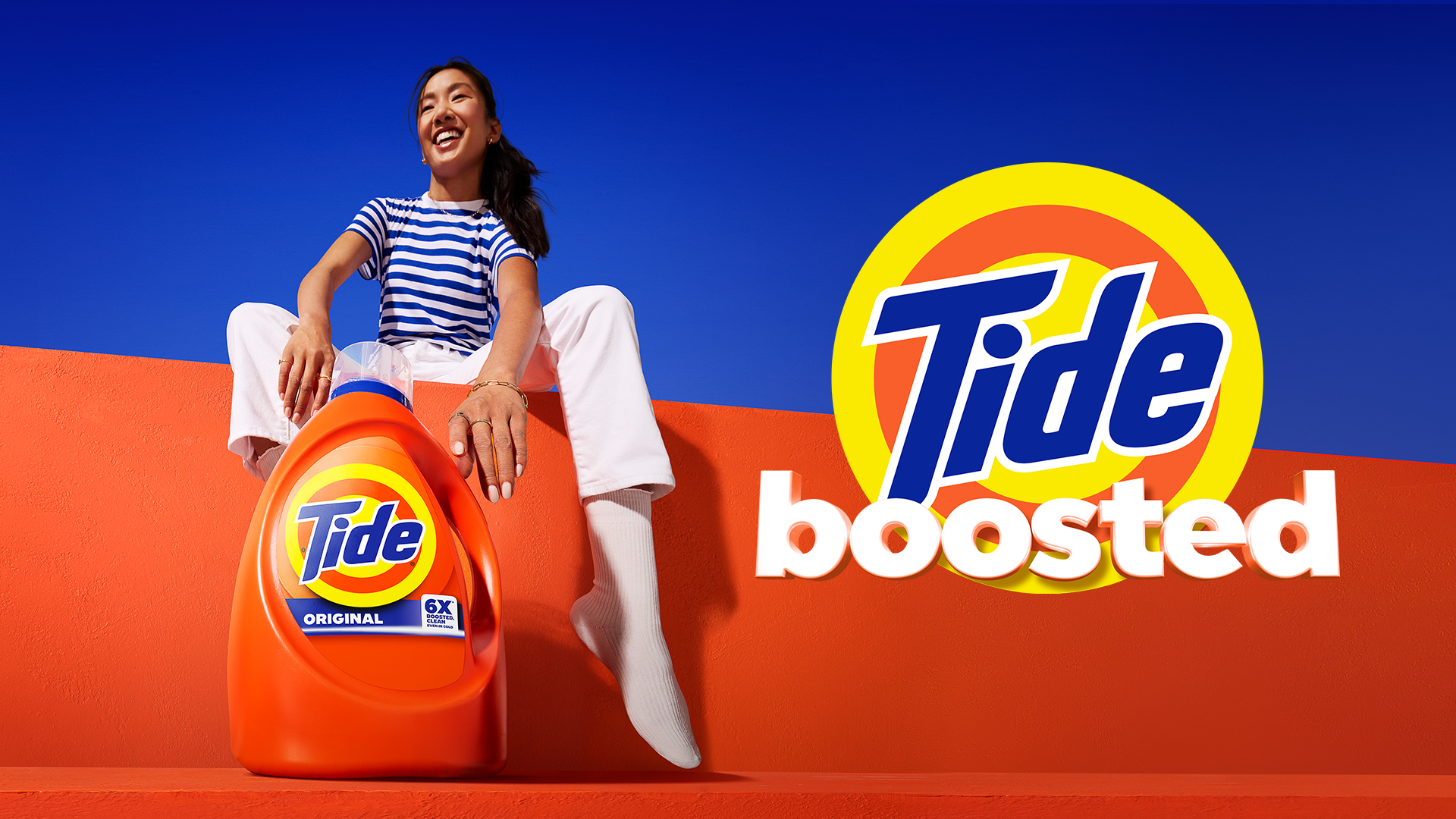
The key visual came out of a structured creative sprint with real consumer input at every checkpoint. Casting was deliberate — faces that felt like the people actually buying Tide today rather than the ones who had been buying it for thirty years. TWorking with our photographer, we developed a lensing approach built around heightened reality — a visual analog for what boosted actually meant. Proportions expand toward the edges of the frame, drawing the eye to our iconic white garments. The angle is low, shooting up, literally elevating the subject — boosting the image the same way the product boosts the clean. A white hoodie, white socks, against a Tide-blue sky.
CLIENT
Procter & Gamble / Tide
PROJECT
Commerce Activation + Toolkit for the relaunch of base Tide
ROLE
Creative Director
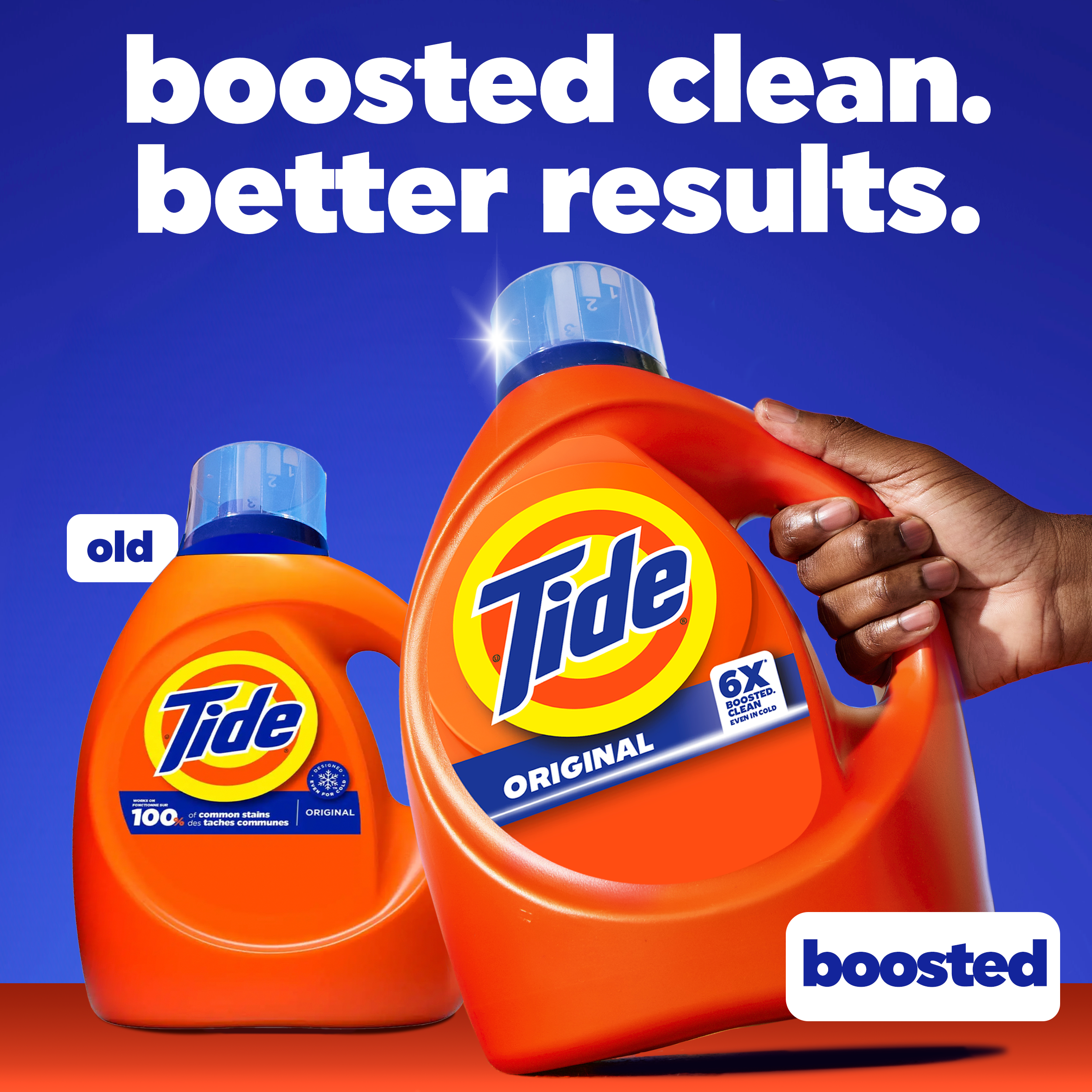
Boosted clean. Better results.
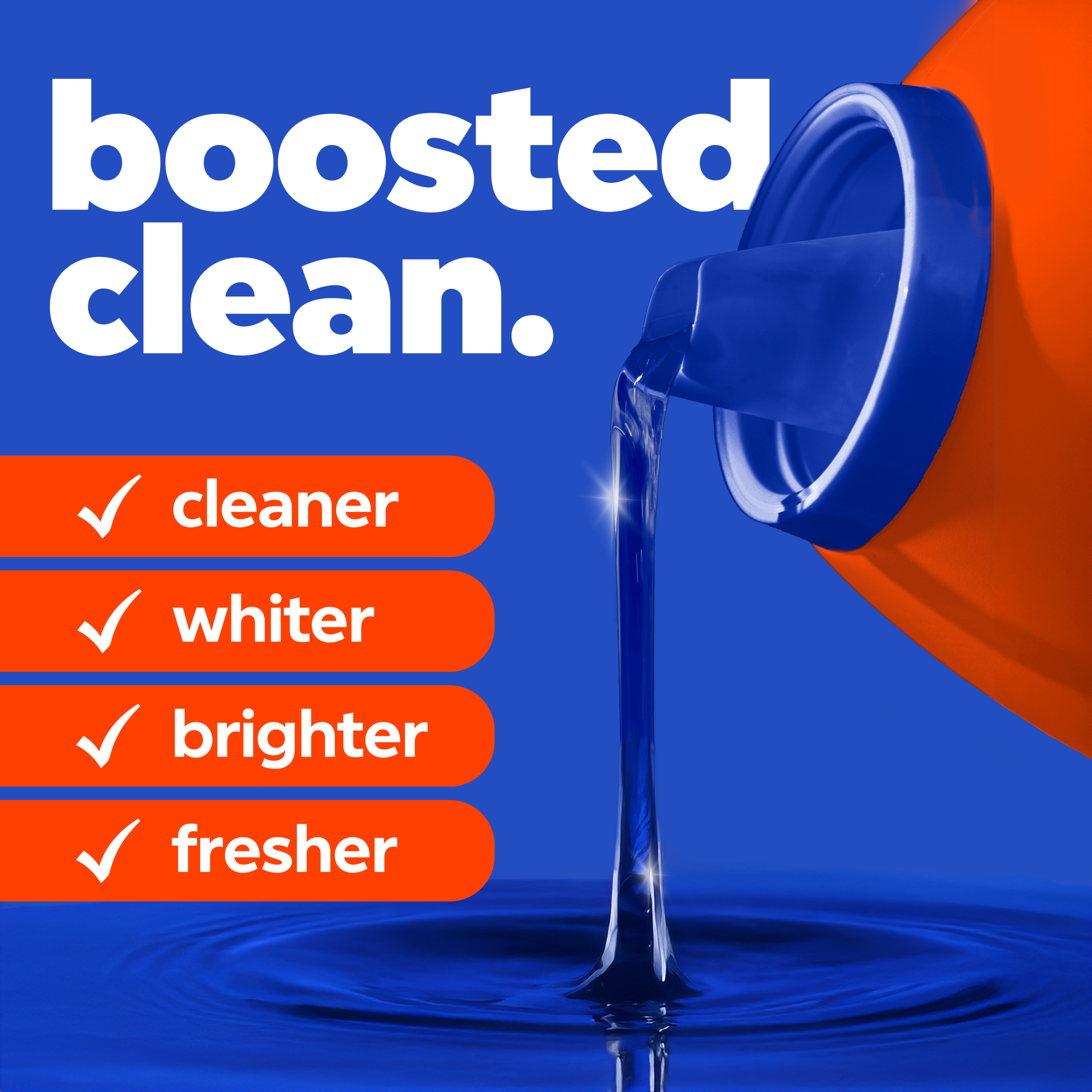
The formulation had been meaningfully upgraded — more fragrance, noticeably stronger cleaning performance — but the brand had earned its loyalty precisely because shoppers trusted what was already in the bottle. Leading with new formula or improved language risked signaling that the product they'd been using wasn't good enough — or worse, that the brand had changed something they didn't want changed. Boosted threaded that needle. It communicated uplift without implying correction, and gave us a platform wide enough to carry everything from product efficacy to campaign energy.
Getting It Into Hands/Washers
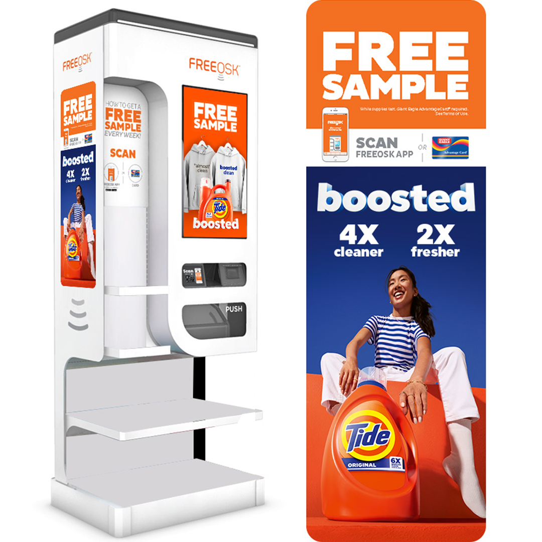
We knew the product would convert skeptics on trial. More fragrance and stronger cleaning performance are things you experience, not claims you evaluate. So driving trial became the real work — and club retail gave us the environment to do it at scale. Free-standing kiosk takeovers at Sam's Club put the product directly in shoppers' paths, anchored by claims simple enough to absorb at a glance: 4X cleaner. 2X fresher. The kind of numbers that don't need explanation when the product is already in your hand.
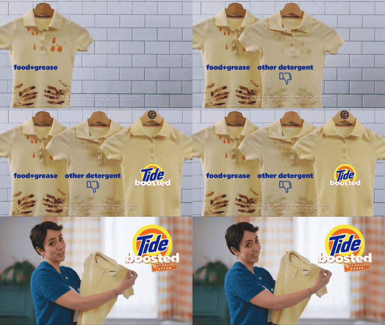
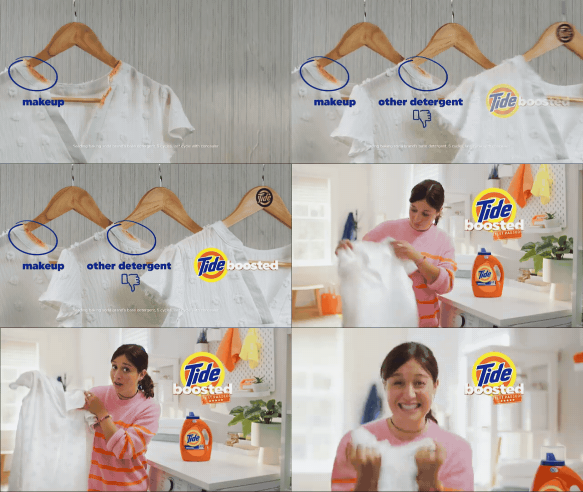
The Tri-by-side
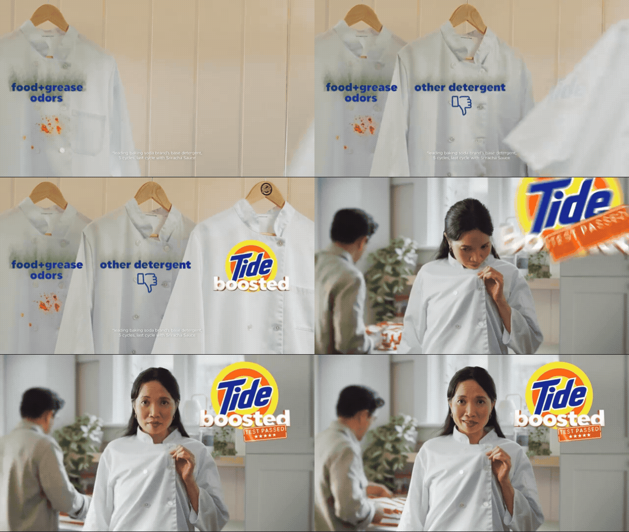
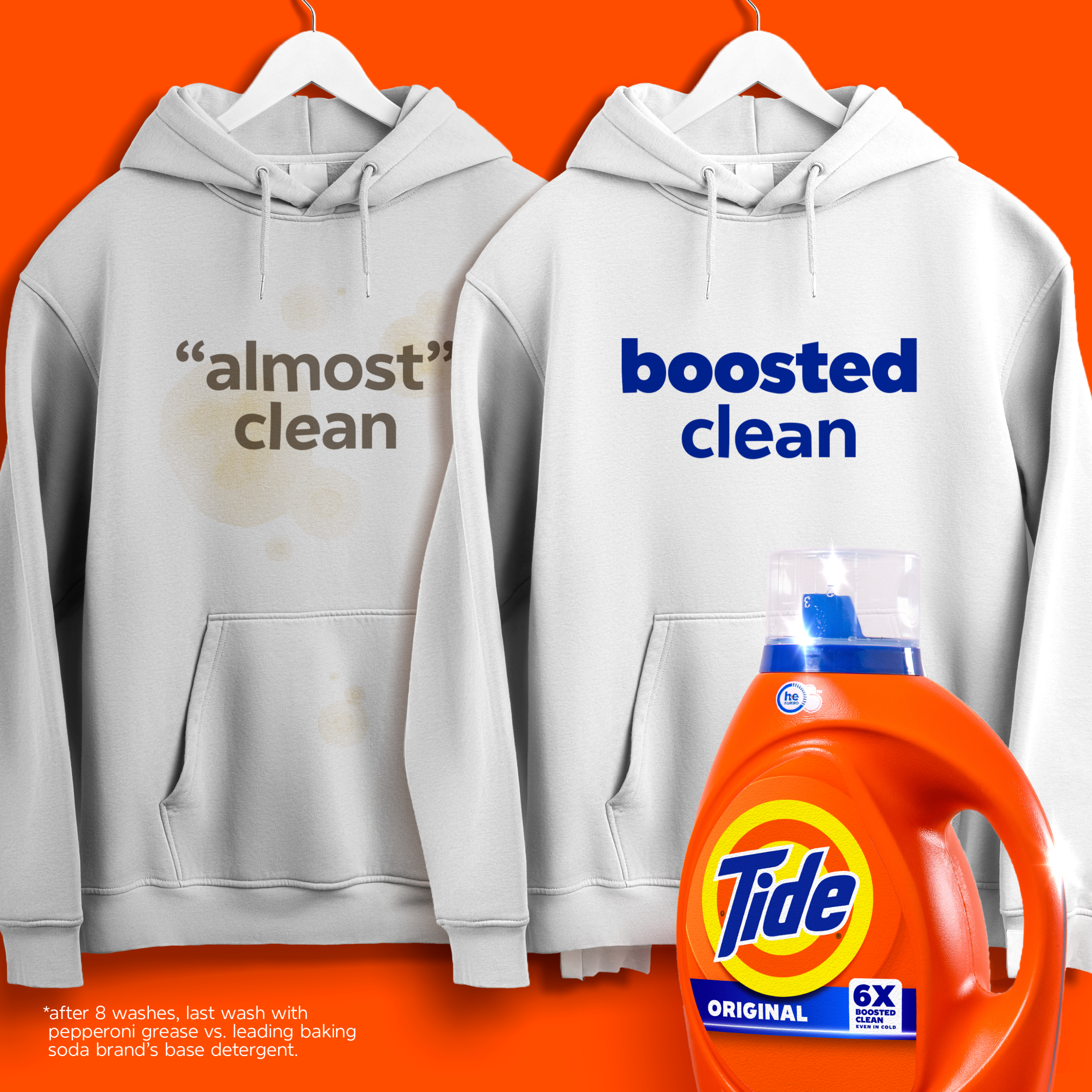
We knew side-by-side comparison drove trial, but we needed to show three things simultaneously — the stain, the competition, and the Tide difference. Not just stain removed but entire garment whitened. We called it the tri-by-side.
The brief was to create something iconic, that could live in three to five seconds, work across commerce and above-the-line activations, adapt to different garments, and be repeatable by different filmmakers without losing consistency. Our contribution was the system: the framing, the backward reveal motion, a Tide-emblazoned hanger that anchored readability, and on-screen graphic treatments that layered in the kind of information density shoppers have trained themselves to absorb. People process multiple streams of content simultaneously now — the tri-by-side was built for that.
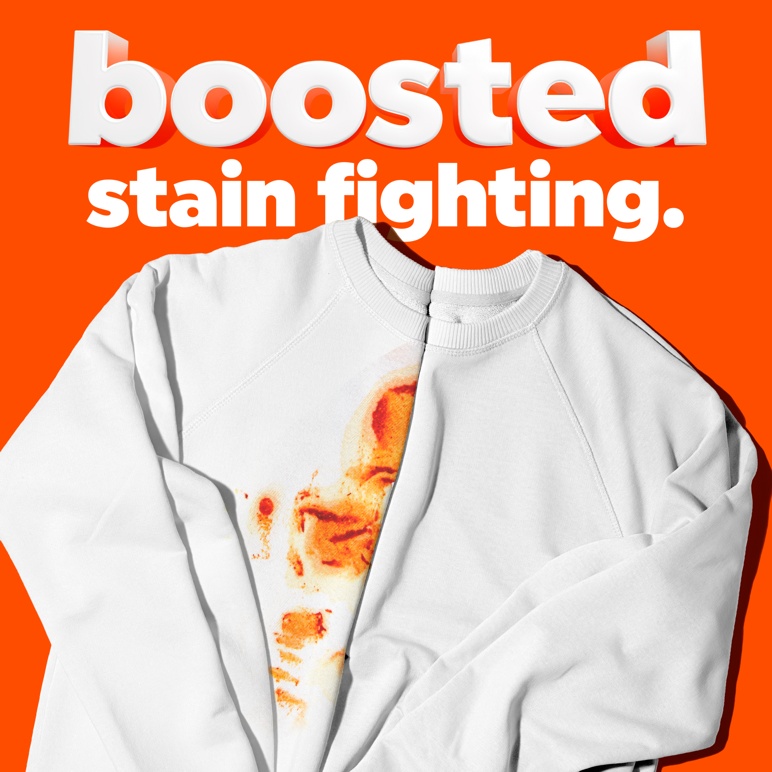
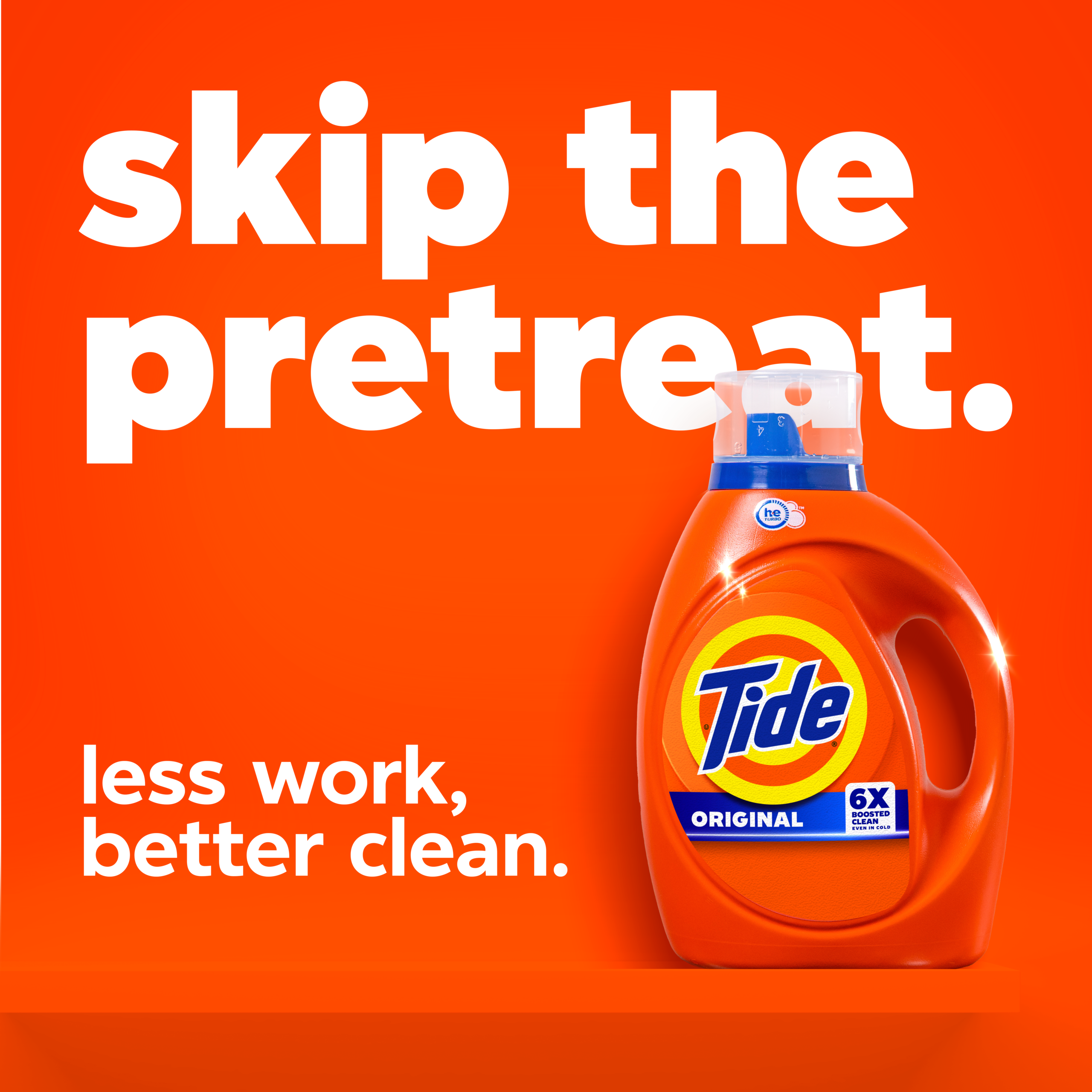
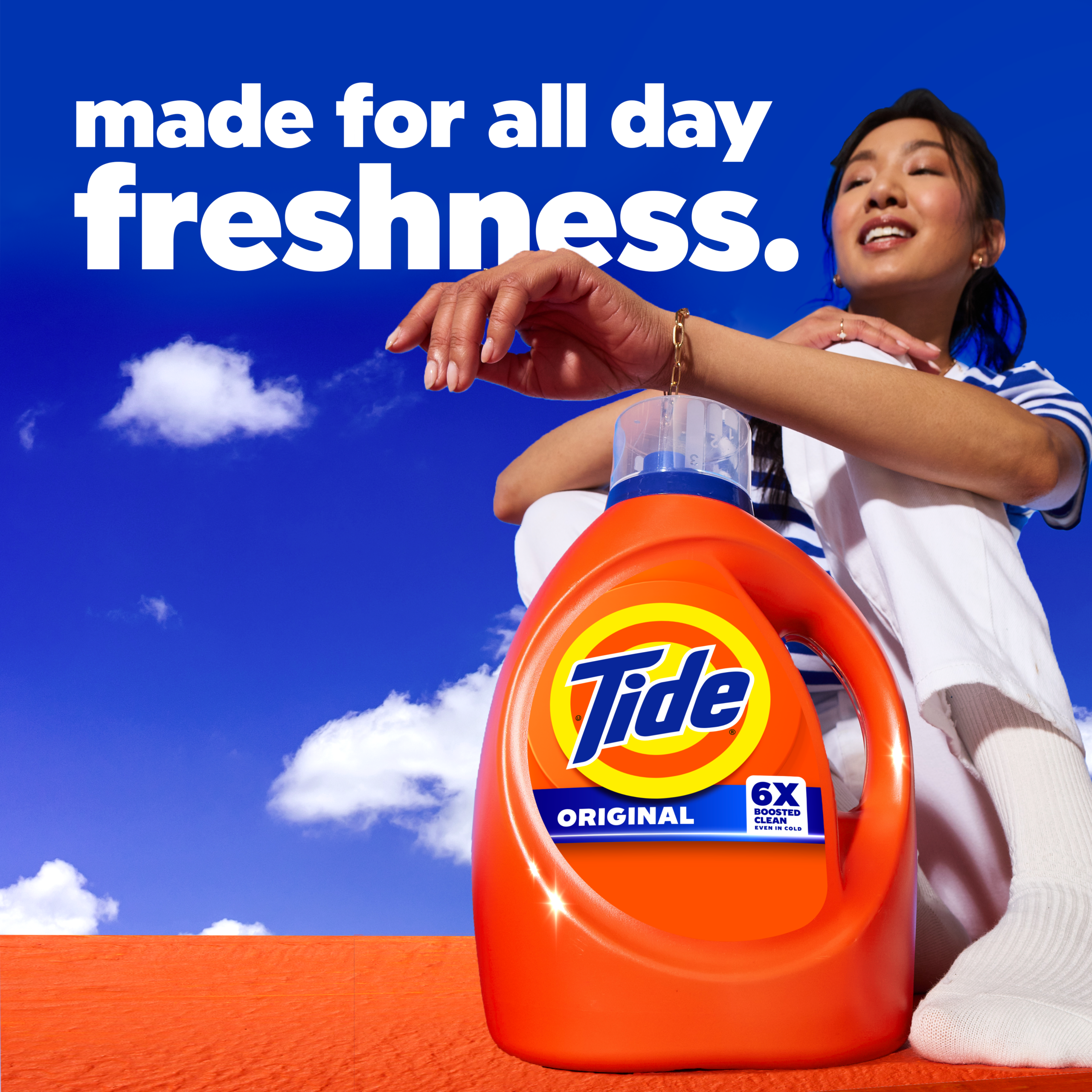
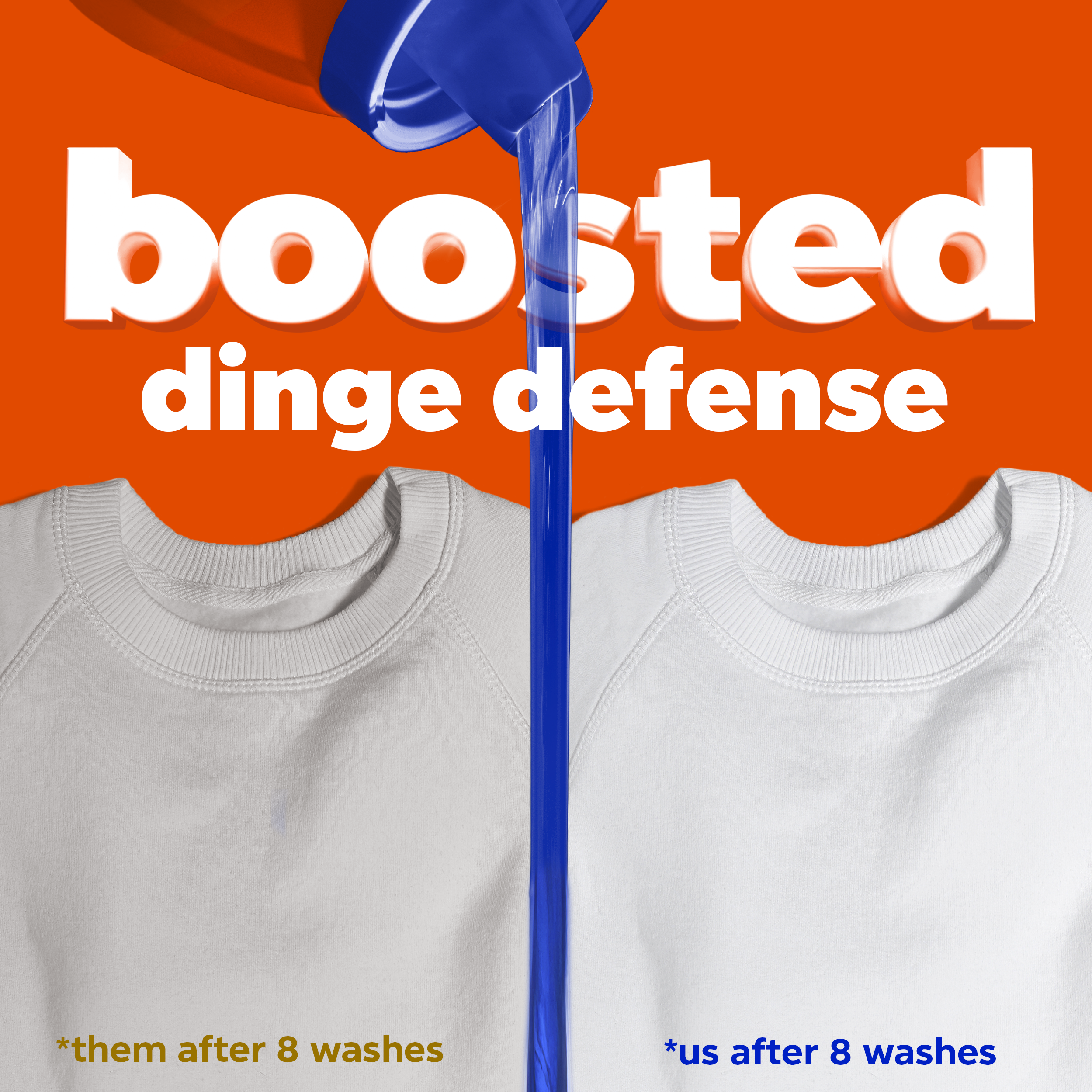
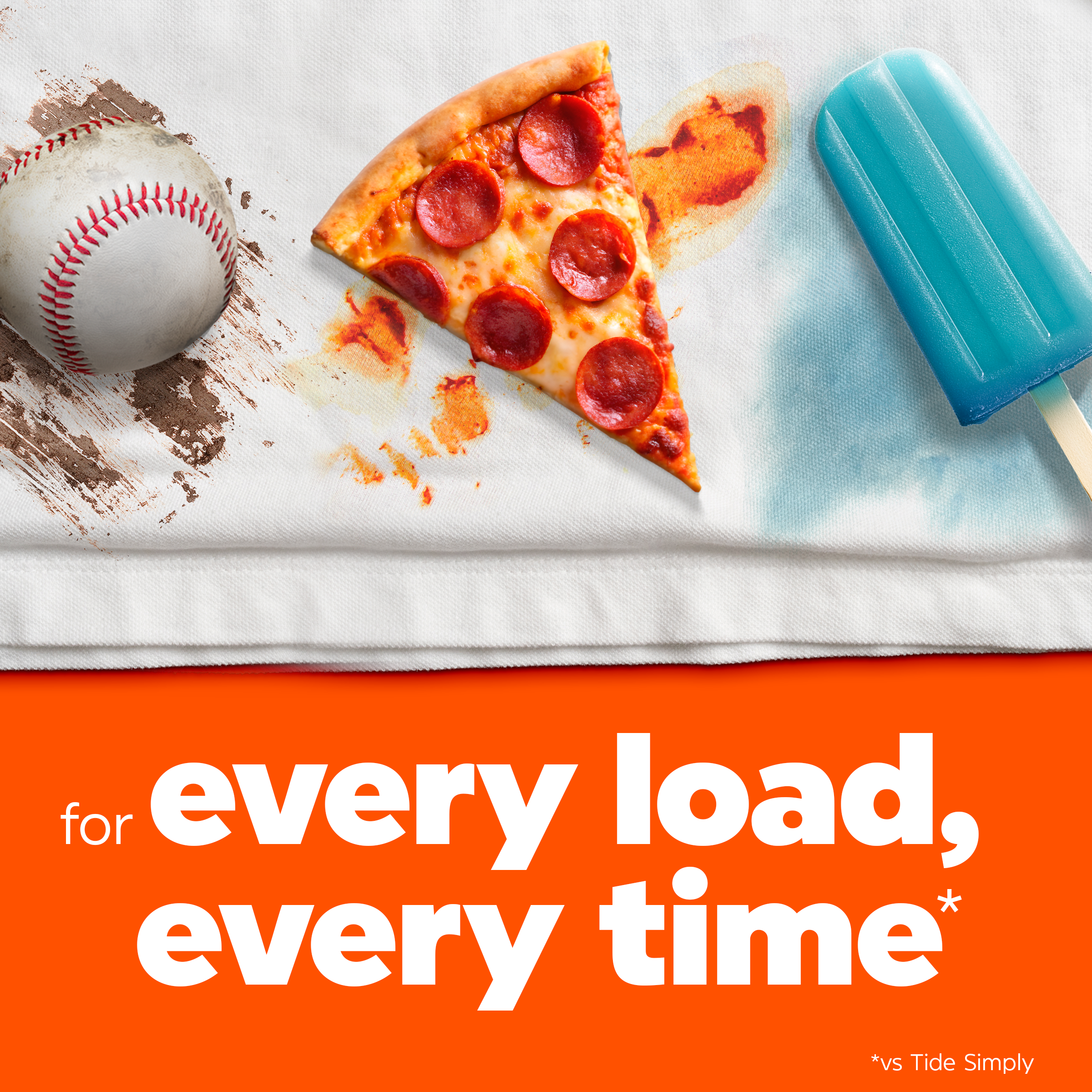
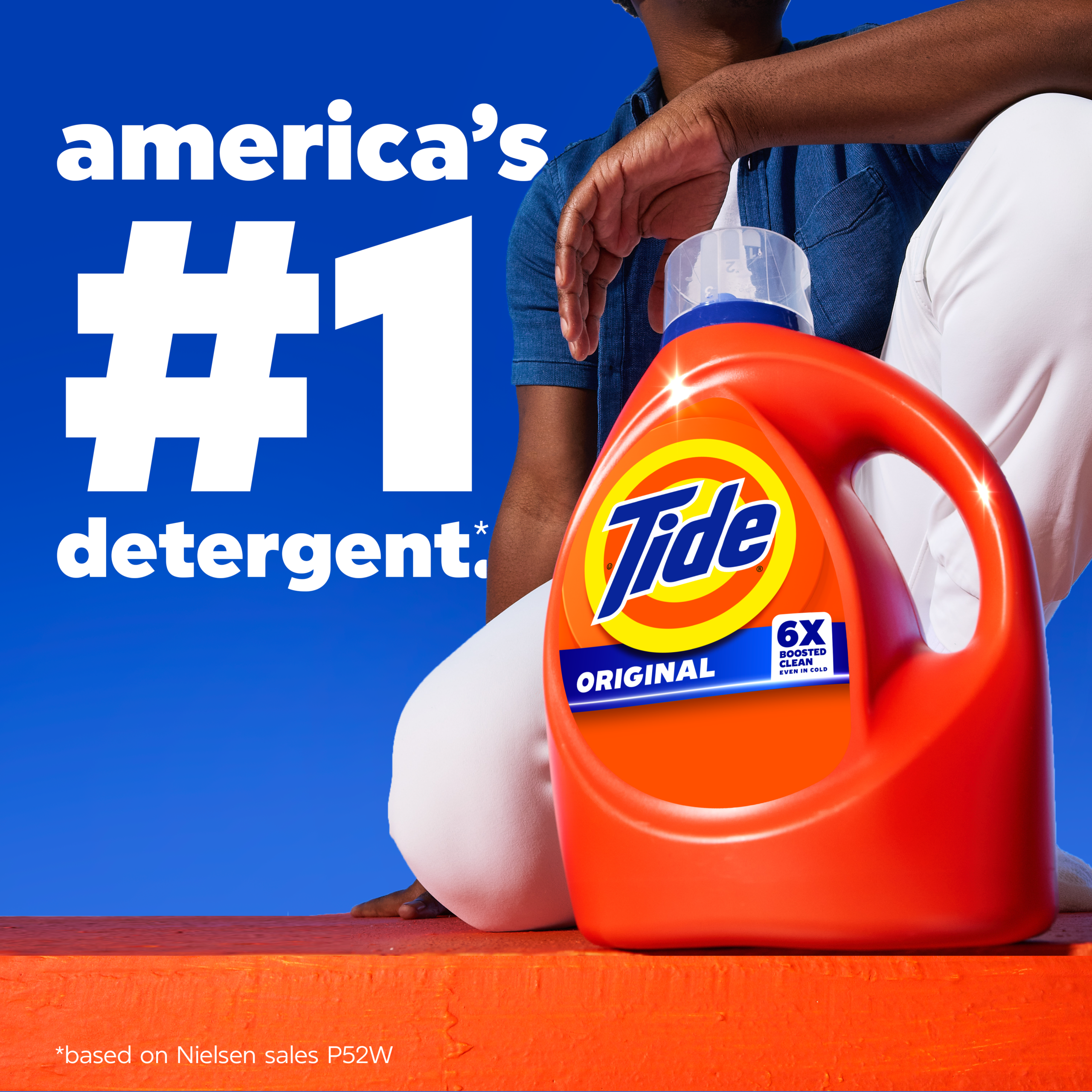
A Suite of Tools, Not a Single KV
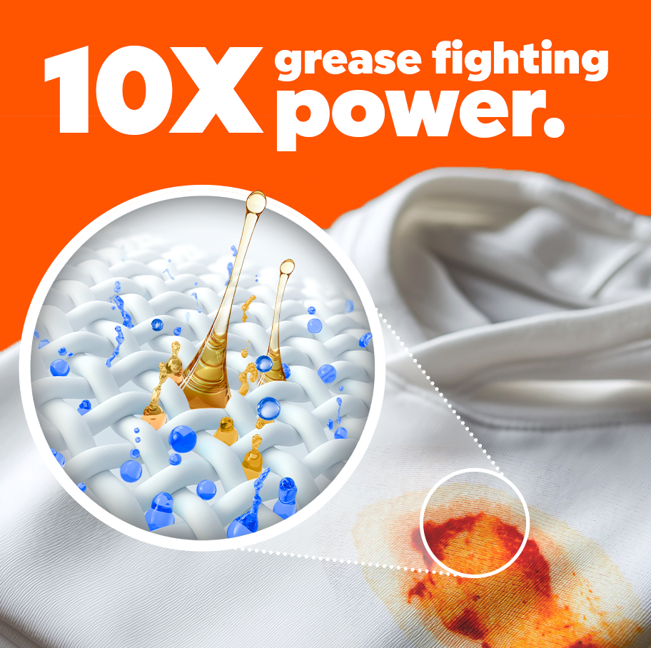
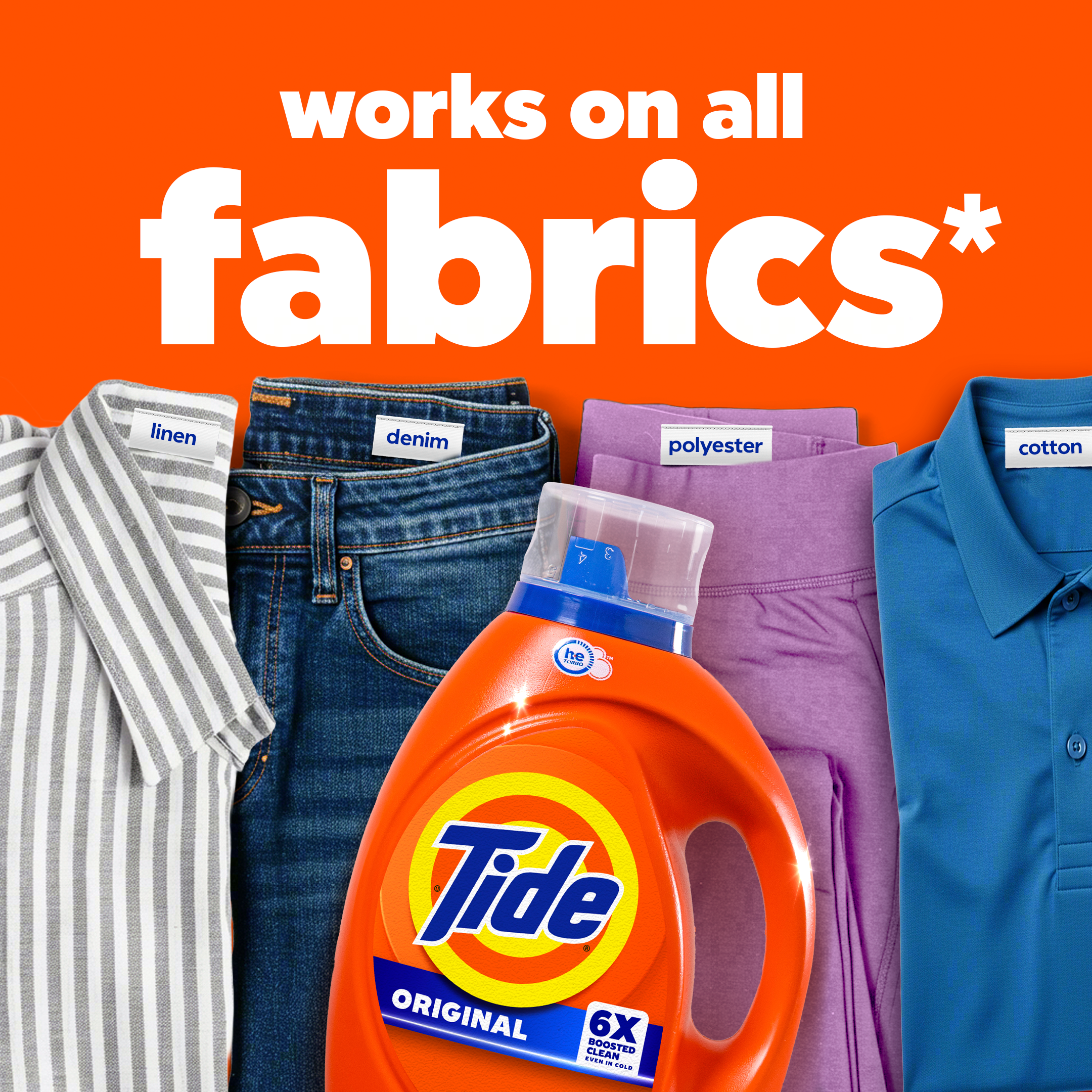
One of the most deliberate choices we made coming out of the sprint was to not deliver a singular key visual. Instead, we developed a library of branded assets, each tested with consumers and designed to work independently or together across any ecommerce environment.
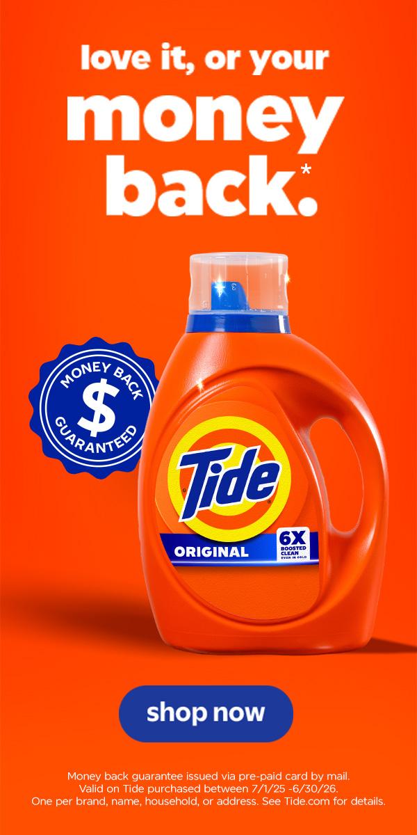
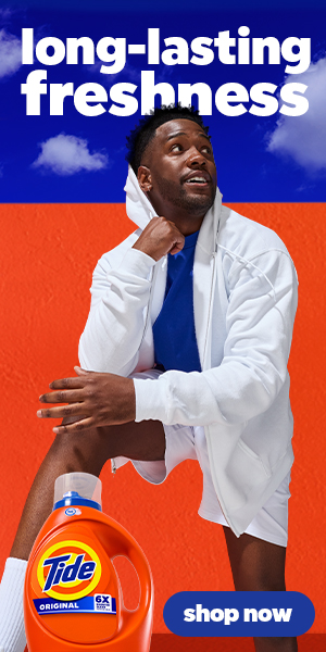
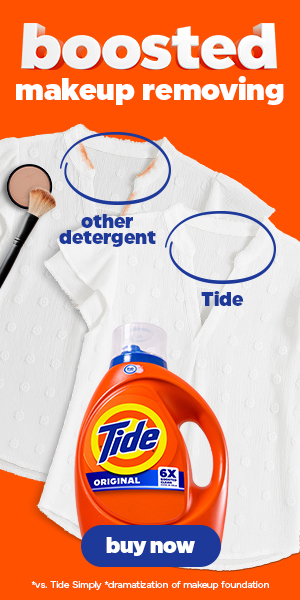
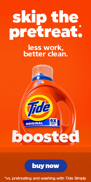
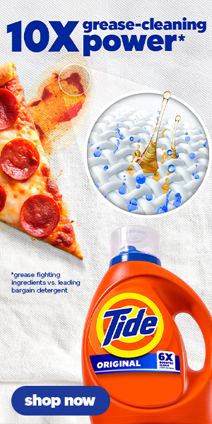
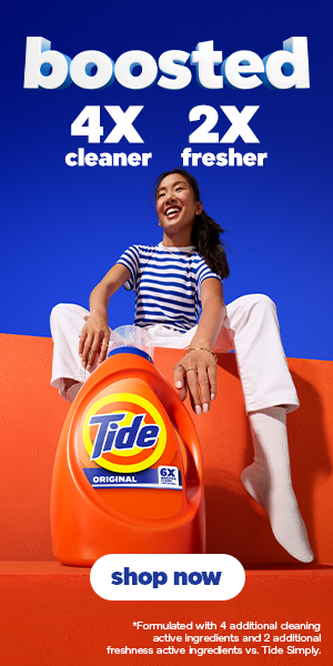
Enhanced content, banners, retail media, PDPs — each platform has different shoppers with different triggers. This system was built to be tested, rotated, and optimized retailer by retailer, giving brand and retail teams a toolkit instead of a mandate. The visual language stays consistent. What performs best gets deployed.